Understanding The Benefits And Importance Of Data Visualization In SaaS

The SaaS industry is worth an estimated $195 million in 2023. While the software-as-a-service sector has a high worth, it’s also no secret it (and the companies who fall within it) tend to grow slowly. Over the last five years, this industry segment has only grown about 4.8%, perfectly embodying the adage “slow and steady wins the race.”
However, it’s important you also understand that your SaaS company’s growth rate can be slowed or quickened based on the decisions you make and the tools you utilize. One tool you shouldn’t underestimate the importance of is data visualization.
Data visualization helps secure steady year-over-year growth for your company and may also streamline various business operations or procedures. Keep reading to learn how to leverage data visualization in your SaaS company and why it’s crucial you do so.
What Is Data Visualization?
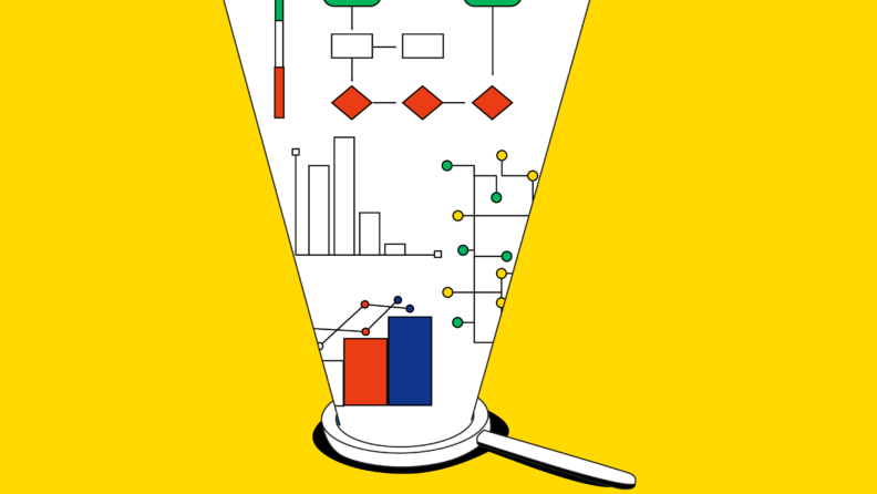
Data visualization is any format that enables you to communicate data visually. It’s the process of taking numbers and turning them into something more tangible so those without a solid understanding of data analysis or mathematics can easily make interpretations without direct translation from data scientists.
You’ve been using basic data visualization methods since grade school. If the term itself isn’t familiar, the formats used are. For example, common formats used in data visualization include:
- Graphs
- Pie charts
- Bar charts
- Heat maps
- Infographics
- Scatter plots
- Area chart
- Line chart
Why Is Data Visualization Important?
Data visualization helps data scientists analyze complex data sets to extract valuable insights from them. They also help other company stakeholders to understand trends, problems, growth, and other crucial elements required of decision-makers. Understanding the benefits of data visualization will help you better understand the importance of implementing it in your SaaS company.
The Benefits Of Data Visualization
Data visualization provides your software-as-a-service company with several distinct benefits. Collectively, these benefits will help secure steady growth, streamline relevant business processes, and increase your business intelligence efforts. The most significant individual benefits are discussed in more detail below.
Better Decision-Making
Effective data visualization allows stakeholders to make data-driven decisions. Many key executive and management team members will have a basic understanding of data analytics. But not every decision-maker is an expert in data science.
However, the human brain generally processes visuals better than raw data, spreadsheets, or reports of key data points. Even better, this ability to more quickly and accurately process visuals facilitates the comprehension of large data sets in a relatively short time. Decision-making will be better overall, and it will be faster.
Simplify Complex Data
Did you know that every minute of every day, Google conducts about 5.7 million searches, and about 6 million people shop online? Along with other online activities, these contribute to the 2.5 quintillion bytes of data created daily across the globe.
But what does this mean for you?
It means a lot of data is being created, and a portion of that big data is relevant to you. But with large amounts of data comes increased complexity, making it hard for anyone but dedicated data analysts to decipher.
That’s where data visualization comes in.
Using the right data visualization tools and formats can help simplify this astounding amount of data into easily digestible bytes (pun intended). The best data visualization tools will let you compile key individual visuals on user-friendly dashboards.
Promote Storytelling With Your Data
Data isn’t only relevant in making a final decision. It’s also applicable in persuading others to support your ideas, theories, and action plans. Using graphical representation and other visualization formats allows you to present the data supporting your thoughts in the most persuasive way possible. Your data has a story, and visuals help you tell it in a way others can relate to.
Save Significant Time
When done effectively, data visualization can save time across the board. For starters, utilizing the right software or machine-learning programs can decrease time spent on accumulating, aggregating, analyzing, and sharing your data. From there, decisions can be made faster, allowing your SaaS company to react to shifting trends or identified errors quickly.
Challenges That Come With Data Visualization
While data visualization provides significant benefits to your SaaS company, it isn’t without challenges. Foremost among them are:
- Choosing the wrong chart type, thus reducing effort efficiency
- Presenting data that is inefficient or misleading
- Creating cluttered visuals, thus making them challenging to understand
- Oversimplifying data
- Making data unnecessarily complex
- Challenges balancing aesthetics and information
Researching the best data visualization practices and staying up to date with relevant trending topics can help you overcome many of these challenges. Taking time crafting visuals and double-checking your work is also important. If possible, get another set of eyes on your finished visuals before publishing or presenting them.
4 Ways Data Visualization Can Help You Scale SaaS
The software-as-a-service industry maintains steady but slow growth, which generally holds true for individual companies. But scaling your SaaS business is crucial if you want to stay competitive and prosper.
Data visualization plays a key role in helping you scale your business. Four key ways visualization techniques can help you meet business goals include integrating vendors, elevating marketing strategies, improving KPIs, and automating key operations.
Integration of Vendors
Data visualization makes it easier to integrate new vendors into your SaaS company. Although SaaS management tools are relatively expensive, effective data visualization allows you to integrate broad vendors. For example, you could easily implement ERP and HR application contract management tools by giving security brokers access through the cloud.
Financial integration is another way data visualization can be used. Finding reliable business partners is crucial in all integrations meant to help you scale your SaaS business.
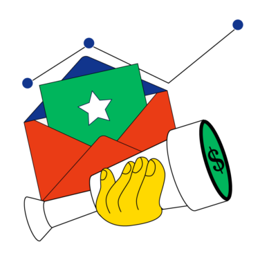
Elevated Marketing Strategies
You could have the best software in the world, but nobody will ever know without efficient marketing. Without making use of the most effective marketing strategies possible, it’s unlikely your business will prosper.
The foundation of all effective marketing is a solid understanding of your target audience. Who is purchasing your product, and what are they using it for? What problem do your customers have that you solve for them?
The answers to these questions lie in data, provided you have a sound CRM data management strategy.
You might get some of your customer data from your website or the information provided by the sales and customer service teams. But you can also purposefully garner information through customer reviews and surveys.Once customer information has been aggregated from all sources, you can analyze it for the most comprehensive picture. That information can then be turned into visuals that help your marketing and management teams make better business decisions related to your marketing strategies. Better decisions in this department can help you stay competitive, remain profitable, and achieve company objectives more effectively.
Improved Business KPIs
KPI stands for “key performance indicator.” These are used to value the success of an organization or specific activity by creating a quantifiable measure of performance. You can use KPIs in your SaaS company to track:
- Monthly revenue collected
- Average or specific lifetime customer value
- Amount of subscribers
- Customer acquisition cost
- Traffic to lead and lead to conversion ratios
Using data visualization can bring your KPIs to life and make it easier to identify any issues. For example, viewing your KPIs in a charted or graphical format might show that customer acquisition costs have gone too high or that your monthly revenue has slowly decreased over the last 12 months.
Faster identification can improve your KPIs by enabling you to react faster. As soon as the problem is noticed, you can create solutions to help your SaaS company get back on the right track.
Automated Key Operations
Automation is an easy way to help your company scale. By freeing up time spent on tedious tasks, employees can devote their time to other endeavors. This allows you to maximize your available total work hours, increasing your productivity without hiring additional team members.
The role data visualization plays in your efforts to automate key operations is through identification. A quality program will help you identify the areas where automation is possible and then implement the appropriate avenues for doing so.
For example, let’s say your customer service department struggles to keep up with high volumes. Your visualized data paints a story where many reps spend time on easily answered, frequently asked questions. A significant portion is also spending time taking credit or debit card payments.
Once you’ve identified these problems, you know that automation can significantly help ease the burden on your customer service reps. You implement chatbots on your website and use machine learning to teach them the answers to frequently asked questions. Then, you create an online portal that automates many potential payment options. After these automations, your call volume is down, keeping wait times low and promoting a more positive customer experience.
More Articles
- The 17 Best Account Management Books to Master Client Journeys
- What is Sales Forecasting? Your Key to Informed Decisions
- What is CPQ: A Guide to ‘Configure, Price, Quote’ for RevOps Teams
- 4 Benefits of Conversation Intelligence Software: How Can It Enhance Your Operations?
- 18 Business Intelligence Books You Can’t Miss
A Few Real-Life Examples Of Data Visualization
You may find it helpful to see how a SaaS company can use data visualization in real life. Examples of how your company may use this strategy include:
- Using a bar chart to identify your busy and slow seasons
- Plotting an area map to determine your company’s reach
- Creating infographics to relay crucial statistics related to a specific sector or department
- Utilizing a pie chart to show your customer’s demographics
- Using a line graph to map out historical sales trends
Tips And Considerations
Below are a few tips and considerations to help you successfully implement, track, analyze, and present data visualizations of critical SaaS metrics:
- Use data visualization tools: Using one or more data visualization tools (depending on the size and objectives of your company) can help save time and hassle. Plus, these tools moderately reduce the risk of human error skewing your data results.
- Understand the best visual representations: Different formats will work better for different data types. Use research with trial and error to determine the right formula for you. For example, bar graphs may be used to represent month-by-month growth, but line charts may work better for annual growth metrics.
- Become familiar with a range of data visualization formats: Before presenting data in the most effective format, you must first be familiar with the different methods you can use for your visual representations. Research and play around with various graphs, charts, and even dashboards, until you feel comfortable with each.
- Expand how you use data visualization: The use of data-based visuals extends far beyond board meetings and internal company reports. You can use data visualization to share information with your customers via social media. Or create real-time counters on your website that represent aspects of your company that clients want to know most.
- Embrace simplistic beauty: Data visualization is an art form that can create truly beautiful actionable insights. However, it’s also easy to get carried away with potential aesthetic elements and end up with something cluttered or eye-straining. You can avoid this by embracing simplistic beauty in all types of data visualization.
- Check and recheck everything: Data visualization tools help reduce the risk of human error. While reduced, the risk does still exist. That’s why you must check and recheck your work at each stage in the process. Recheck your numbers before creating your visual, and then recheck your visual before presentation or publishing. Whenever possible, get a second set of eyes at every stage.
- Make it easy: When possible, consider creating standardized templates that your data analysts can use when presenting information. This takes some of the work out of creating visuals while promoting better understanding amongst your decision-making team by using a format they’re familiar with.
Master The Art Of Data Visualization
Data visualization provides several key benefits to your SaaS company. Foremost among them are the ability for steadier growth, better decision-making, and easier data interpretation.
For more information on data visualization that can help you master this art, subscribe to our newsletter today.