16 Types Of Data Visualization (And When To Use Them)


Data, Data, Data. It’s all we talk about in the RevOps world. For some teams, it seems like data is more important than closing sales. However, while the importance of the data we collect as RevOps professionals can’t be understated, it often is underutilized.
If you’ve ever stared at table after table of unoptimized and unorganized raw data, you’ll know there are some simple steps that can be taken to ensure you and your team actually use collected data to find key insights and make profitable decisions.
Creating effective, clear, and accurate visuals aids is an essential piece of understanding your audience and creating actionable strategies around growing revenue and reducing sales acquisition costs. Let’s start at the beginning though.

Need expert help selecting the right tool?
With one-on-one help, we guide you to your top software options. Narrow down your software search & make a confident choice.
What is Data Visualization?
Data visualization is a way of showing different types of data in pictures. It helps people understand complicated information easily. Various types of visualization techniques, charts and graphs are used to illustrate patterns, trends and insights from the data in an easy-to-read format. This makes it easier for your teams to catch trends, make decisions and/or find areas needing improvement more quickly than if they were just looking at text or numbers.
When is Data Visualization Helpful?
Anyone familiar with marketing in the internet era will have heard the term ‘show, don’t tell’ more than once. Using data visualization is the literal next step of this cliche.
A savvy RevOps professional can transmit a tremendous amount of insight in just a few images rather than big summaries, tables, or presentations.
Here are 5 of my favorite use-cases to start building your visual aid database around:
- Simplify complex data: Data visualization simplifies complex datasets by presenting them in a visual format that is easier to understand and interpret. It enables your RevOps teams to identify patterns, trends, and correlations that might be difficult to discern from raw data alone.
- Facilitates data-driven decision making: Data visualization provides a clear and concise representation of key performance indicators (KPIs), metrics, and trends. This empowers your RevOps teams to make informed decisions based on data analysis, identify areas for improvement, and allocate resources effectively to drive revenue growth.
- Enhances communication and collaboration: Visual representations of data help convey complex information quickly and efficiently, facilitating better collaboration and alignment across different teams and departments involved in revenue operations.
- Enables proactive monitoring and forecasting: RevOps teams can track progress towards goals, identify early warning signs, and take proactive measures to address issues before they impact revenue. Additionally, data visualization allows for forecasting and predictive analysis; which allows leaders to anticipate trends, make accurate projections, and plan strategies accordingly.
- Promotes data-driven culture: Implementing data visualization as part of a RevOps strategy fosters a data-driven culture within the organization. When teams have access to clear, visual representations of data, it encourages them to engage with and explore the data more actively.

Types of Data Visualization
There are essentially a limitless array of dashboards, charts, graphs, and visualizations you can use to show data in any other form than a table. Stay away from tables! However, just using a visual aid for no-reason only creates confusion and misinterpreted data. In general, there are a several core categories of data presentation.
First, identify what you’re trying to accomplish and then use the corresponding visual aid. The list below as well as this link to examples of the visual aids in this document are a great place to start understanding which aid fits where in your data strategy.
The first two, relationships and comparisons, are often used interchangeably. But there are some subtle differences.
Due warning: This can be a huge undertaking and can feel overwhelming to understand the first glance over. There are a lot of tools that can be used to quickly create visual aids rather than building them from scratch in Excel (the standard). We’ve already written an article that helps you pick which data visualization tools fit your needs the best when creating different types of charts and visuals.
Relationships
A relationship refers to the connection between two or more variables in a dataset. It explores how changes in one variable are related to changes in another variable. Relationships can be categorized as positive, negative, or neutral.

Scatter Plot: A scatter plot is a graph that displays the relationship between two variables as a series of points on a Cartesian plane. Each point represents a unique data observation, and the position of the point indicates the values of the two variables. Your RevOps teams can use scatter plots to analyze the correlation between different metrics, such as the relationship between customer satisfaction scores and revenue growth or the relationship between marketing spend and lead generation.
By examining the overall pattern of the points, RevOps professionals can identify trends, clusters, or outliers and make data-driven decisions to optimize revenue operations.
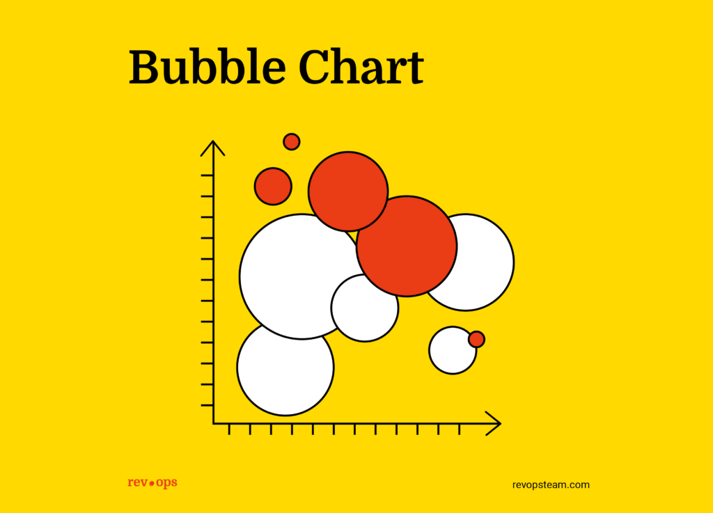
Bubble Chart: A bubble chart is a type of data visualization that represents three dimensions of data using the position and size of bubbles or circles on a two-dimensional plane. It combines the elements of a scatter plot and an additional dimension, typically represented by the size of the bubbles.

Area Chart: An area chart is a variation of the line chart where the area between the line and the x-axis is filled with color. It is effective in illustrating the cumulative totals or proportions of multiple variables over time. Your RevOps team can use area charts to visualize the growth of different revenue streams, track the distribution of marketing spend across various channels, or compare the market share of different product categories.

Line Graph: A line graph displays data as a series of points connected by straight lines. It is commonly used to show trends and patterns over time or to track the relationship between two variables. Your teams can employ line graphs to visualize sales performance over a specific period, customer acquisition rates over time, or the relationship between marketing spend and revenue growth.
By examining the upward or downward slopes of the lines, you can identify patterns, forecast future trends, and make data-driven decisions to optimize revenue operations.

Line Chart: A line chart displays data as a series of points connected by lines. It is commonly used to show trends and patterns over time or to track the relationship between two variables. Your team can employ line charts to visualize sales performance over a specific period, customer acquisition rates over time, or the relationship between marketing spend and revenue growth.
Comparisons
A comparison, is different from a relationship, by examining the similarities and differences between different groups, categories, or conditions within a dataset. It focuses on assessing how one variable differs across various subgroups or conditions.

Bar Chart: A bar chart is a graphical representation of data using rectangular bars. The length of each bar corresponds to the value it represents, making it easy to compare different categories or variables. Use bar charts to visualize and analyze data such as sales revenue by product, customer satisfaction ratings by region, or marketing campaign performance by channel.

Bar Graph: A bar graph is a chart that represents data using rectangular bars of different lengths. It is used to compare and display categorical data or values across different groups or categories. Use bar graphs—or variations of it like the bullet graph—to visualize and compare sales performance by product, customer segments, or geographical regions.
This chart allows professionals to easily identify top performers, track progress towards goals, and allocate resources effectively based on the insights derived from the bar graph.

Funnel Chart: A funnel chart is a specialized chart that illustrates the progressive reduction of data as it passes through different stages or categories. The chart is shaped like a funnel, with the width of each section representing the quantity or proportion of data at that stage. Funnel charts are commonly used in sales and marketing to track the conversion rates of leads through the different stages of the sales process.
Your RevOps team can utilize funnel charts to identify bottlenecks in the sales pipeline, optimize conversion rates, and focus efforts on the most effective stages or areas to drive revenue growth.

Radial Wheel: A radial wheel chart, also known as a spider chart or polar chart, displays multivariate data on a circular graph with multiple axes extending from a central point. Each axis represents a different variable, and the data points are connected to create a polygon shape. You can use radial wheel charts to evaluate and compare the performance or characteristics of different entities or categories. For example, you can assess the strengths and weaknesses of different sales representatives across various metrics or evaluate the performance of different operational teams. By examining the shape and size of the polygons, users can identify areas of improvement or potential synergies.
Distributions

Boxplot: A boxplot, also known as a box-and-whisker plot, provides a summary of a dataset's distribution and displays key statistical measures such as the median, quartiles, and outliers. Teams can use boxplots to analyze various performance metrics such as sales revenue, customer lifetime value, or customer acquisition cost.
By examining the boxes and whiskers, your RevOps professionals can identify the range and distribution of the data, spot outliers or anomalies, and gain insights into the overall performance and variability of the metrics.
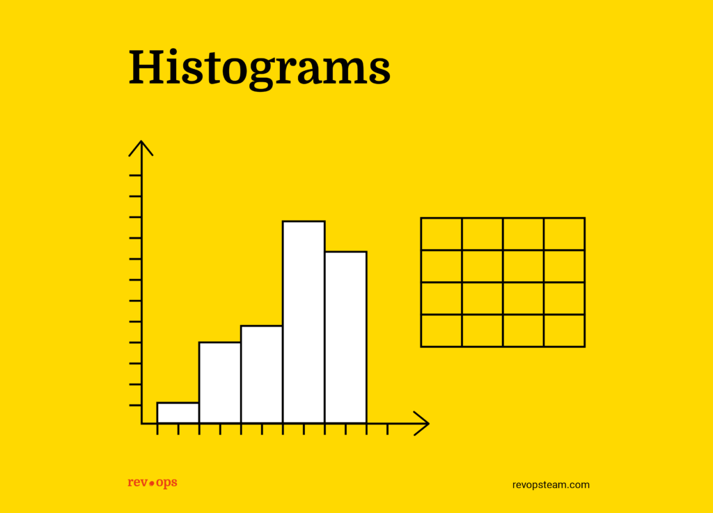
Histograms: A histogram is a graphical representation of the distribution of a dataset. It displays the frequencies or counts of data values falling within specified intervals or bins. In other words, a histogram provides a visual summary of the underlying frequency distribution of numerical data.

Waterfall Chart: A waterfall chart is a visual representation of cumulative changes in a value over time or across different categories. It shows the progression of positive and negative contributions that result in a final value.
You can use a waterfall chart to track revenue changes throughout the stages of a sales cycle, highlighting the impact of different factors such as new deals, upsells, churn, and discounts. This chart allows professionals to understand the overall revenue movement and identify key drivers for revenue growth or decline.
Compositions
These compositions help in presenting data in a clear, concise, and meaningful way, allowing viewers to understand patterns, trends, and relationships within the data. The present data mostly in relation to the entire data set rather than to external factors.

Pie Chart: A pie chart is a circular graph divided into sectors, with each sector representing a proportion or percentage of the whole. Pie charts are used to illustrate the distribution or composition of a data set.
Teams can employ pie charts to visualize the revenue breakdown by product category, the market share of competitors, or the allocation of resources across different operational areas. Pie charts provide a clear and intuitive way to understand proportions and percentages, displaying areas of focus or imbalance.

Donut Chart: Similar to a pie chart, a donut chart is a circular graph with a hole in the center. It represents data using colored segments that correspond to different categories or variables.
Donut charts are useful for illustrating the same types of information as pie charts, but with the added ability to display multiple data sets or compare two different periods or scenarios side by side. You can utilize donut charts to visualize and compare sales distribution between two regions, customer segmentation by industry, or the revenue contribution from different product lines.

Percentage Bar: A percentage bar chart is similar to a regular bar chart but represents the data as a percentage of the whole. It is used to visualize proportions or relative contributions of different categories.
You can employ percentage bar charts to analyze the market share of competitors, the composition of customer segments, or the distribution of revenue across various product lines. Ex. examine the length of the bars to quickly understand the relative importance of different categories and make informed decisions to optimize revenue operations.
Project Management
Here’s a personal opinion. There is no such thing as a bad gantt chart. There are only people who don’t know how to use it and set it up wrong. The gantt is all powerful. But, like a Greek god, its power is flawed by the complexities of human nature.

Gantt Chart: A Gantt chart typically consists of a horizontal bar chart with each bar representing a specific task or activity. The chart displays the start and end dates of each task, as well as the duration and progress of each task.
Dependencies between tasks can be shown by linking the bars with arrows. Milestones, which are key events or deliverables in the project, are also marked on the chart. The proper use of a Gantt chart can be a huge benefit to keeping projects on-time and on-task.
Need expert help selecting the right Business Intelligence (BI) Software?
We’ve joined up with Crozdesk.com to give all our readers (yes, you!) access to Crozdesk’s software advisors. Just use the form below to share your needs, and they will contact you at no cost or commitment. You will then be matched and connected to a shortlist of vendors that best fit your company, and you can access exclusive software discounts!
Skip the Overwhelm
Visuals are supposed to assist decision making and make large data sets more easily understood. Find a software that fits your needs and leverage the speed of the human brain. Remember the human brain can process visual information 60,000 times faster than text.
Data visualization plays a crucial role in empowering revenue operations teams and data analysts to drive data-informed decision-making and achieve organizational success. Ultimately, by embracing data visualization, RevOps teams can unlock the power of specific data and make informed decisions that drive revenue growth and operational efficiency.
If you found this article helpful, don’t forget to sign up to our newsletter for more like it in the near future!


