How To Design A Smart Business Intelligence Dashboard That Works

Outdated, irrelevant, and incomplete data costs businesses an average of $15 million per year, according to research from Gartner. Wouldn’t you rather use that money to hire talented employees, purchase new equipment, or make your current processes more efficient? Yeah, us too. A business intelligence dashboard can help.
At the RevOps Team, we aim to help you increase efficiency, maximize revenue, and improve your decision-making capabilities. We know the importance of using business intelligence to your advantage, so we created a guide to help you understand what a business intelligence dashboard is and how to design one that works for you.
What Is Business Intelligence?
Every organization relies on data to make informed business decisions. At the end of the year, how do you determine who qualifies for a bonus? You probably review sales reports, performance reviews, and other documents to find out how well each employee performed. That’s just one example of how data helps managers make decisions.
Here’s another example. If you have three product lines, how do you assess their performance? Do you go with gut feelings, or do you review the results of customer surveys, calculate how much each product line costs to maintain, and check sales reports to see which one brings in the most revenue?
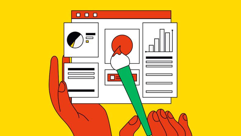
Business intelligence takes raw datasets and turns them into user-friendly reports, graphs and bar charts. With good data sources and a strong business intelligence program, it’s possible to drill down and find out exactly how your company is performing.
Best of all, business intelligence makes it possible to assess performance at the individual, departmental, and organizational levels. Want to know which member of your sales team brought in the most revenue during 2022? BI can give you the answer.

Need expert help selecting the right tool?
With one-on-one help, we guide you to your top software options. Narrow down your software search & make a confident choice.
Why Should I Have A Business Intelligence Dashboard?
A business intelligence dashboard gives decision-makers access to actionable insights on a single screen. BI dashboards also help firms save a huge amount of time and money. Just imagine how much time it would take to have someone go through thousands of data points to extract the most relevant information, then present it in a visually-appealing way that's easy for everyone to understand. With a robust BI dashboard, it’s easy to streamline the process of collecting and analyzing the data.
Before we move on, it’s important to understand the difference between a BI dashboard and a BI report. Reports provide an in-depth overview of a specific topic, such as how much money each department spends on a monthly basis. In contrast, a BI dashboard gives business users a real-time summary of what’s happening in the business. For example, you can customize your dashboard to display key performance indicators (KPIs) or other metrics.
Business intelligence also makes it possible to answer questions like these:
- How much is our average sale (in dollars)?
- Which employee made the most sales last month?
- What is the average age of our customers?
- Should we adjust the pricing on our new line of sneakers?
- At what time of day does our brick-and-mortar store have the most customer traffic?
- Which sweater is more popular with customers, the red one or the blue one?
As you can see, using a BI dashboard leads to better decisions, which may improve your company’s long-term business performance. Business intelligence also makes it easier for non-technical users to understand complex data.
Dashboard Design Elements
Ready to get started with business intelligence? Make sure you include key stakeholders in the BI dashboard design process. End users should have access to several types of data, including the KPIs most relevant to their job duties.
Customizable Interface
For best results, your BI dashboard should have a customizable interface. Not every employee needs to see the same data, so it doesn’t make sense to force your entire team to view the same metrics. For example, the people on your customer service team won’t really benefit from viewing data related to employee turnover or manufacturing costs. They need to see customer satisfaction scores and other relevant metrics.

Interactivity
Users should also be able to interact with your company’s BI dashboard. An interactive dashboard offers a combination of real-time business insights and historical data, making it easier to get answers to your most pressing questions.
If you’ve been relying on static reports, here’s why you should use an interactive BI dashboard instead:
- Static reports answer specific questions, but there’s no way for readers to ask follow-up questions or get more information on related topics. An interactive dashboard makes it possible to answer any question that arises.
- It takes a long time to compile static reports, especially if you’re using spreadsheets or other tools that weren’t designed to provide real-time insights. Self-service BI dashboards allow users to create their own custom reports within minutes.
- Static reports pull data from one source, such as a payroll system or accounting program. A BI dashboard gives you an overview of multiple data sources, making it easier to make data-driven decisions.
Real-Time Data
It’s important to have access to historical data, especially if you’re involved in forecasting. That said, you can’t rely solely on historical data to make critical business decisions. Trends change quickly, so using data that’s a few weeks or even a few days old can cost you. A business intelligence platform gives users access to real-time data, increasing the accuracy of their reports.
Online Accessibility
Between 2019 and 2021, the number of people working from home tripled. If you want to enjoy the benefits of BI dashboards, you can’t just install some dashboard tools on your local server and call it a day. Online accessibility makes it easy for employees to access BI tools no matter where they are, whether they work from home or travel.
Standard Templates
Don’t feel like you have to reinvent the wheel when you’re designing your business intelligence dashboard. Standard templates make it easy to produce detailed reports without spending hours coming up with the perfect format.
Sharing Capabilities
The most helpful BI dashboard examples have sharing capabilities, allowing users to perform data analysis and then share the results with their colleagues. If you’ve been looking for a way to increase transparency across all departments, this is it.
Best Practices For Designing Your BI Dashboard
Now that you understand some of the use cases for BI dashboards, it’s time to design your own. Here are some best practices to keep in mind.
Design it for the target audience
As we mentioned early, not everyone needs to see the same data. Optimize your dashboard so that it shows only the data employees need to make day-to-day decisions. If you provide a customizable interface, users can always create new reports if they need more information about a metric.
Integrate data and provide context
Without context, data lakes—huge repositories of data—aren’t all that useful. Users need context to help them understand why certain metrics are important or how they compare to other data points. For best results, make sure your analytics dashboard includes milestone dates, year-over-year comparisons, or other clues to guide the decision-making process.
Define goals and drive actionable insights
Before you roll out a business intelligence dashboard, think about what you’re trying to achieve. Clearly define each business objective and make sure that the dashboard displays helpful information that helps users make better decisions.
Avoid clutter
When it comes to your BI platform, less is more. Eliminate unnecessary visualizations to prevent team members from getting overwhelmed. With a customizable interface, a user can always dig deeper if they need more insight.
More Articles
- The 17 Best Account Management Books to Master Client Journeys
- What is Sales Forecasting? Your Key to Informed Decisions
- What is CPQ: A Guide to ‘Configure, Price, Quote’ for RevOps Teams
- 4 Benefits of Conversation Intelligence Software: How Can It Enhance Your Operations?
- 18 Business Intelligence Books You Can’t Miss
Allow collaboration
If a user notices something interesting about the metrics displayed on your BI dashboard, they should be able to investigate further. Make sure that your BI platform allows users to discover insights of their own instead of only the metrics provided.
Leverage AI
Once your dashboard is up and running, use augmented analytics to uncover additional insights. These tools combine artificial intelligence with machine learning to enhance the way users analyze data and use it to make decisions.
Need expert help selecting the right Business Intelligence (BI) Software?
We’ve joined up with Crozdesk.com to give all our readers (yes, you!) access to Crozdesk’s software advisors. Just use the form below to share your needs, and they will contact you at no cost or commitment. You will then be matched and connected to a shortlist of vendors that best fit your company, and you can access exclusive software discounts!
Gain Insight Into Critical Business Operations
You can’t just collect data and save it for a rainy day. You need a platform that integrates data from several sources and makes it easier to understand what that data means. Subscribe to the RevOps Team newsletter to stay abreast of new trends in business intelligence and the various ways you can maximize your company’s revenue.